As a web designer the one of the most important things we can provide our clients is a clear and easy way for them to be reached on their site. For example as a web designer when someone wants to begin a project with us they’ll most likely either fill out a form or schedule an appointment. Gravity Forms helps us to provide our customers with a reliable and easy to use form.
Before Gravity Forms we would use other free contact form plugins for WordPress that did have fields that you can have such as name, email, phone number, etc. However, they lacked other features that were very important to us such as functionality and aesthetics.
Top Gravity Forms Features
Conditional Logic
Conditional logic allows us to include, as the name implies, conditional questions to a form. For example you may ask the question, “Does your business have an existing website?” and then if answered yes you can provide a follow up question that asks. “What is your website URL?.” This helps declutter unnecessary questions as well as gives the user a more engaging and interactive experience. To see an example of this watch the video included in this post.
Purchasing
Gravity Forms has the ability to link to paypal so that you can receive payments seamlessly through your form. Many clients have used this feature with great success to create quick and easy membership forms and event registration.
Appearance Customization
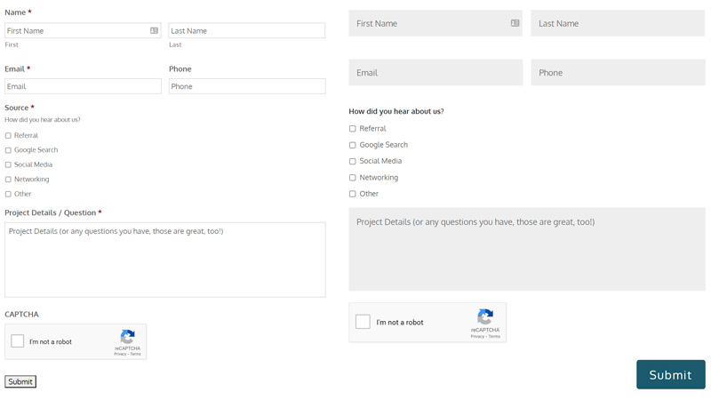
When we first started designing websites over a decade ago, contact forms were all pretty bland. Nobody expected them to be anything but functional. Having a cohesive style applied to all elements of a website is a must these days.
We set out to find a contact form that could accomplish everything we needed from conditional logic and purchasing (as described above) to achieving a certain “look.” Gravity forms was so popular among designers that we had no trouble finding CSS that mimicked the Divi style of contact form—arguably much more pleasing to the eye than the default look.

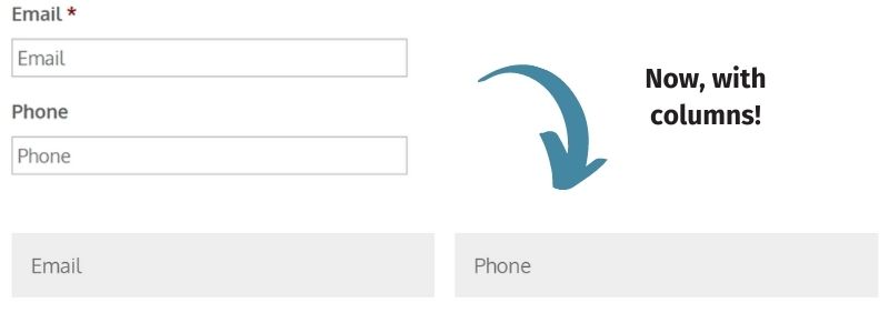
Along with the custom CSS for overall appearance, we can organize fields in columns using the Gravity Forms advanced builder. That helps with the forms we make to flow much better to the eye.

Integrations
When a complicated project lands on our plate, we are able to face it with confidence because the tools we utilize are versatile, and our team is resourceful. We are very grateful for the developers over at Gravity Forms and their desire to make the plugin as robust as possible without sacrificing user-friendliness.
Since we began using Gravity Forms, clients have been able to collect basic contact information, facilitate fundraisers, build affiliate-based companies, create complex cover letters in the medical field, receive HIPAA protection, and more. How? Because Gravity Forms has add-ons and integrations. Here are a few:
- Stripe
- PayPal
- Authorize.net
- Mailchimp
- Zapier
- PDF View
- Signature
- Coupons
If you’re interested in learning more about gravity forms, visit their website at gravityforms.com. If you found this post helpful, check out our other Tools of the Day on our blog page.

