One of the key tools in our design process is using storytelling to build out wireframes. It allows us to quickly produce design and copy in a way that creates a story for our clients that they can invite their customers into. The biggest thing that distinguishes this method is it makes the customer the hero of the story and positions the business as the guide. We’ve found this process to be extremely effective for our clients.
So how do we apply story to a homepage? We break it down into six main sections – header, stakes, value stack, process, guide, and authority.
Header
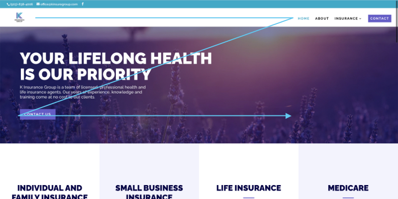
The header is the most important part of your website. It’s the first thing that people see, so it’s crucial to make a good impression. A good header will consist of a clear description of how your site solves the customers problem and will be accompanied by engaging imagery that helps to visualize it. The other thing is taking advantage of how people read in a Z pattern. It’s best practice to have the company logo in the top left, menu items with a call to action button in the top right corner, then the header text and main button in the middle. See pictures below for an example.
Stakes
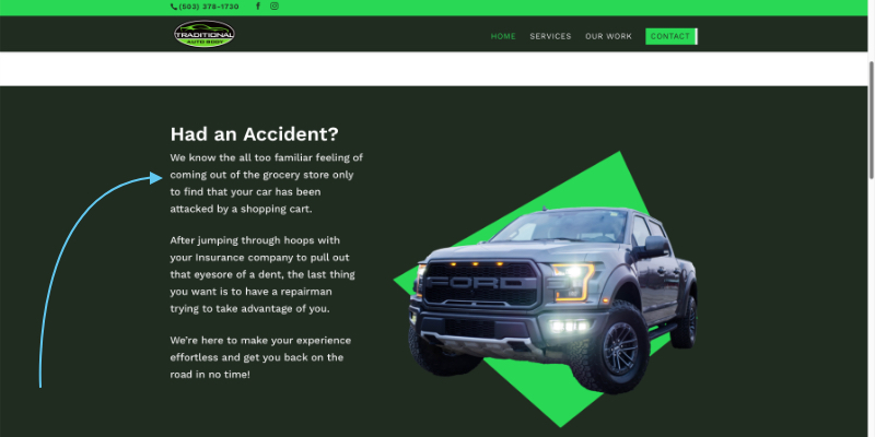
The stakes section is your chance to clearly establish what your customers’ problem is. The more you know about the end user, the better you’ll be able to create a direct statement that piques their interest.
Value Stack
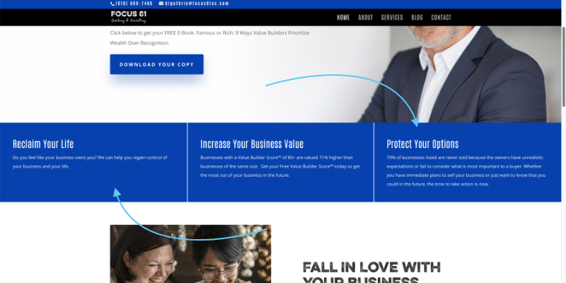
Here’s your chance to tell them exactly how your product or service will solve the user’s problem with a list of 3–5 ways the business can add value to their life. Depending on the situation, we’ll sometimes add this section before the stakes. For instance if the business offers many different services and it’s too difficult to summarize in a brief one liner above the fold, we may list out the services directly after the header. Overall, it’s generally better to introduce the problem before the solution.
Process
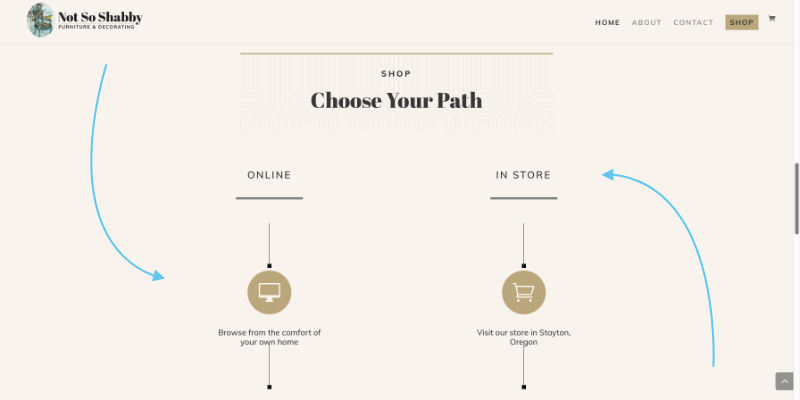
One of the most common mistakes we see on websites is failing to give a clear step-by-step process for the user to take action. Even with a good call to action, users will need more than just a “buy now.” Break down how easy it is to act, and reiterate the value they’ll be receiving in the last step of the process.
We really like how this turned out for our client Not So Shabby who had two different processes of shopping with them either online or in the store. So, we broke down these processes side by side for users to quickly and easily visualize which option works best for them while giving them clear calls to action for either route.
Guide
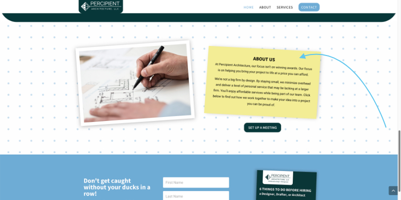
Now you can finally start to talk about your business, but that doesn’t mean the hero of your story changes. The hero should always be the customer. So, how do you talk about your business? By introducing you or your team as the guide who helps the hero overcome the problem they face. If you think about your favorite movie or book, there is likely some guide who helps the protagonist reach their goal.
Authority
The authority section is your chance to back up your argument with endorsements, awards, testimonials, and partners. Showing success stories of other people who have already gone through the process helps the user feel a sense of security and confidence in the product or service.

Do you need a quick win?
The next time you talk to a customer, take notes on their—
- biggest headaches
- ideal results
- favorite part about working with you
This will give you a head start to fill in the stakes, value stack, process, etc. For another speed boost, jump ahead with our messaging guide! ⬇️
