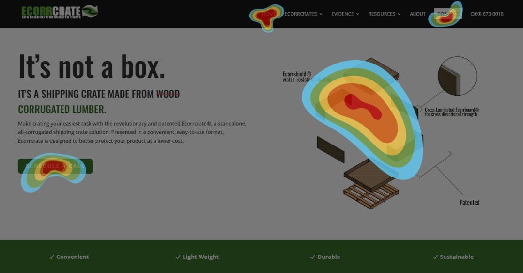
When it comes to enhancing user experience and optimizing website performance, businesses need to have a deep understanding of how visitors interact with their website. This is where heatmaps for websites prove to be an invaluable tool.
Heatmaps offer powerful visual representations of user behavior, helping business owners and operators like yourself make informed decisions about design, messaging, and user navigation. So grab a cup of coffee, sit back, and let’s dig into why heatmaps are the secret sauce for optimizing your website.
1. Understanding User Behavior:
Heatmaps let you see exactly how visitors are interacting with your site. Colorful overlays show you where they’re clicking, scrolling, and hovering the most. By identifying popular areas and elements, businesses can optimize their designs to make highly clicked elements more accessible or prominent, enhancing user engagement.
2. Enhancing Design:
Heatmaps are like x-ray vision for design flaws. By analyzing patterns of clicks and scrolls, you can spot the elements that are getting zero love. This data enables designers to improve the layout, navigation, and structure, ensuring visitors notice and engage with essential elements better.
For example, if a heatmap reveals that your call-to-action button is being ignored more than a kid with broccoli on their plate, it’s time to spruce it up. A little relocation or revamp could do wonders for boosting those conversion rates.
3. Optimizing Messaging:
Heatmaps provide insights into how users interact with specific content and messaging on a webpage. Businesses can assess the effectiveness of headlines, images, and written content by evaluating user engagement patterns. Do users engage more with a particular headline or section? Do they overlook important details? Heatmaps help identify content that needs improvement, enabling you to craft compelling messaging that resonates with your target audience.
4. Improving User Navigation:
Navigating a website shouldn’t feel like solving a Rubik’s Cube. Heatmaps help you identify the areas where users are getting stuck, confused, or just plain lost. By observing the scroll and click patterns, you can optimize navigation menus, search bars, and other elements that play a vital role in user journey and satisfaction.
Let’s say your heatmap shows that users are scrolling like mad just to find your search bar. That’s a sign that it needs to be front and center. By giving it a well-deserved spotlight, you’ll make life easier for your visitors and keep them coming back for more.
5. Mobile Responsiveness:
With the rising dominance of mobile browsing, heatmaps are especially valuable for optimizing websites across various devices. By studying engagement on different screens, you can uncover any pesky elements that are causing problems on smaller devices. A responsive design ensures a user-friendly experience, increasing mobile conversions and visitor retention.
Next Steps:
Heatmaps offer powerful insights into user behavior to inform website design, messaging, and user navigation decisions. By staying on top of user behavior and making continuous improvements, you’ll become a master of exceptional online experiences. That means happy customers, higher conversion rates, and a pat on the back for a job well done.
By leveraging heatmaps and continuously analyzing user behavior, you can stay one step ahead in your quest for providing exceptional online experiences, thereby increasing customer satisfaction and achieving greater success.
Are you ready to get started?
We don’t receive anything if you click on these links. It’s a tool we use and like, so why not share it? We hope it provides the data you’ve been needing all along.

