If you’ve ever had to communicate with a web designer, SEO specialist, or other marketing professional and found yourself a bit confused, chances are industry jargon got in the way. So, we decided to create this overview of website anatomy to help you communicate about yours a little easier.
Plus, you’ll sound super smart when talking to your friends about their sites needing more engaging CTA’s to increase conversions. Am I right?

Browser Components
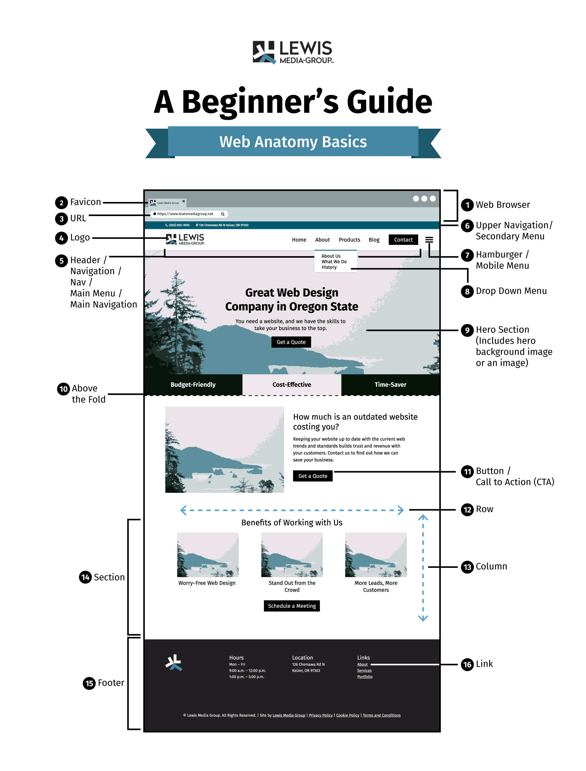
1. Web Browser
A software program used to locate, retrieve, and display content on the World Wide Web, including web pages, images, videos, and other files.
2. Favicon
A small logo or icon that appears in the tab of a web browser as a visual representation of a website.
3. URL
A Uniform Resource Locator (URL) is a unique address that identifies a web page or other online resource. It is used to locate web documents and other resources.
Header Components
4. Logo
A graphical icon (e.g. an image, text or combination of both) is used to represent a brand or organization on the web.
5. Header
The top (or “head”) section of a website that typically contains a logo, navigation menus, and other elements that are the same on each page of the site.
Navigation/Main Menu
A website feature typically located at the top or side of the page which provides a list of links that allow users to navigate to other parts of the website.
6. Upper Navigation/Secondary Menu
A website feature typically located underneath the Main Menu, but above the main content, which provides additional navigation options.
7. Hamburger/Mobile Menu
A button or icon on a website that when clicked or tapped opens a menu containing navigation links.
8. Dropdown
A type of website navigation where a selection of options appears when a user hovers their mouse over a particular item or clicks/taps on it.
Page & Content Components
9. Hero Section
A prominent section of a website that serves as a focal point, usually featuring an attractive image and/or typography.
Hero Image
An attractive, usually large, image that is used in a Hero Section to draw attention.
10. “Above the Fold”
A term used to describe the portion of a website that is visible without scrolling down.
11. Button / Call to Action (CTA)
An acronym for “Call To Action”, is usually a button or a link with a phrase or statement which encourages users to take a desired course of action (e.g. ‘sign up now’).
12. Row
A horizontal space on a web page created within sections, having the ability to contain modules, columns, and other elements.
13. Column
A vertical space on a web page created within rows, having the ability to contain modules, and other elements.
14. Section
A collection of rows and columns which contain other elements that are placed together on a page.
15. Footer
An area at the bottom of a web page which usually contains navigational links and other useful information.
16. Link
An element on a web page that, when clicked, allows the user to navigate to a different web page or a different section of the existing page.

Subpage Components
Subpage
A subpage is a secondary web page under an already existing main web page that contains additional content related to the website’s main purpose.
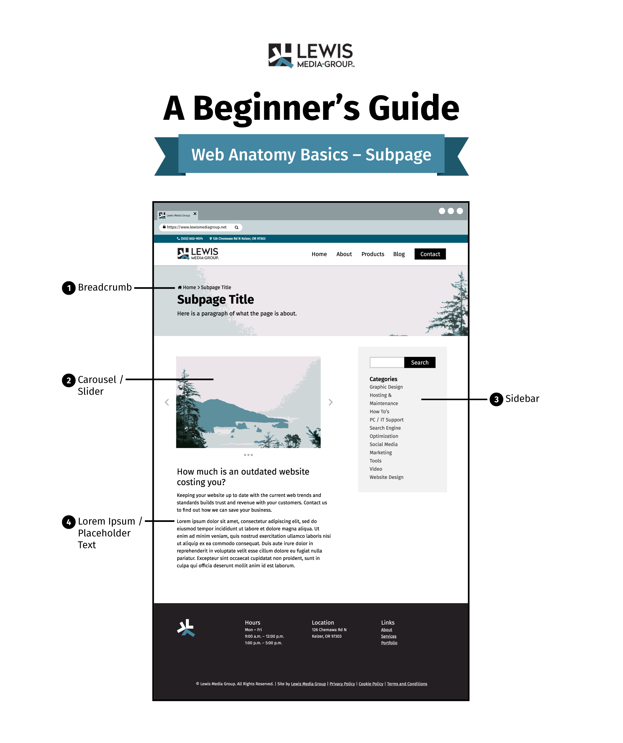
1. Breadcrumb
A breadcrumb in a web context refers to a type of navigation feature that displays a list of links that shows a user’s current location in a website or application. It provides users with an easy way to keep track of their position within the website and allows them to quickly move back to any of the previous web pages.
2. Carousel/Slider
A carousel/slider is a type of user interface element on a website that displays several rotating images or pieces of content that the user can scroll through by clicking or dragging with their mouse or by using the arrow keys on their keyboard.
3. A Sidebar
A sidebar in WordPress is a widget area located to the right of the content on web pages where users can add extra content such as menus, text, images, social media feeds, and other user interface elements to enhance their website’s appeal.
4. Lorem Ipsum/ Placeholder Text
Lorem Ipsum is dummy text often used by designers and developers in place of real text to see how a page’s design will look when filled with actual content.
Wrap Up
So, the next time your designer comes to you asking what page you want featured in the secondary menu, you’ll understand or at least have this post as a reference.
In the meantime, are there any other things you’ve heard related to website structure or marketing that confuse you? Let us know! We’d love to hear so our posts can answer the questions you’ve been pondering all along.
