
Today our web design team is sharing a website audit example to show you some of the things we look for when updating a website. There are a ton of different websites we could have picked, but we took a random approach and asked one of our coworkers to tell us the first website that came to mind. They said kittens, naturally. So, we decided to look at the first three google results for pet adoption.
What do you look for in a quality website?
- Above the Fold – the first things we see upon the page loading.
- How can they solve my problem?
- What step can I make to move forward?
- Basic design and marketing principles.
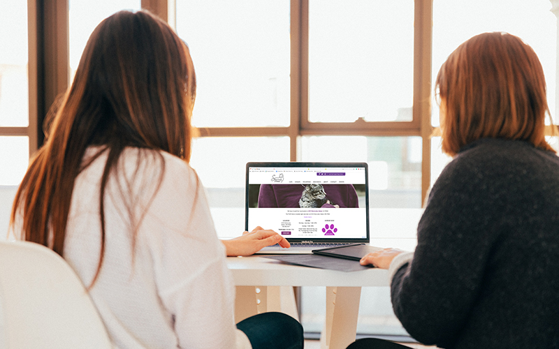
Salem Friends of Felines
When first looking at their site, it’s difficult to tell exactly what they do. Their company name, logo, and imagery are telling me that it has something to do with cats, but if I had no prior knowledge of their organization. I don’t know if it’s a vet, adoption agency, or a cat walking service. When reading, our eyes move in a z-pattern. According to best web practices, we recommend having the company logo in the top left to establish who the company is, a navigation menu with a primary call to action in the top right, and then a one-liner description of what your company does with another call to action.


As you move beyond the fold, this flip flops and you get an information overload. We would have liked to see this broken up into more digestible chunks of information. An easy way to do this is simply adding some headers and callouts throughout to break up the information. After some scanning, we learned that they’re a thrift store and shelter, and we were happy to see their contact info and hours are clearly displayed.
Willamette Humane Society
The first thing that stands out to me on this page is that it lacks contrast. The bright primary colors capture my attention, but they don’t direct it. All of the colors have the same value and proportions which makes it difficult to know where to look. The images are doing a similar thing. The above the fold section should give me a simple and clear message of what they do and how I can connect with them. Because the Humane Society is a well known organization, it seems they may be assuming the clear message is less necessary. Unfortunately, we don’t see that as an excuse to leave customers asking questions. On another note, they do a good job in making it clear how to donate which is probably their most important means of revenue.

Burying the Message
As you move down the page, we discover a really impactful clear message of how “together, we’re saving lives.” The simple message accompanied by a picture of a cat evokes emotion and makes you want to be a part of what they’re doing. This would have been a great header image right at the beginning of the page.

Feathered Friends Bird Rescue
As web designers, we hate to admit that the Google My Business website was actually the best site out of the three by providing the necessary answers to customer questions. Although the site lacks visual interest, it is clear and concise about what they do and how to take action. This is probably why they’re being ranked so high in google. Further, the templated nature of the site is more prominent as you scroll—particularly in the testimonial section that is left empty.

Do I need to audit my website?
This is a great question! The honest answer is, it doesn’t hurt to have an extra set of eyes on your marketing materials. It is even more valuable to have someone who understands the inner workings of those assets and how to produce results through them. Take some time to look through your website with these concepts in mind, and present them to your web designer. If you don’t have one or want another opinion, our team is happy to help. Give us a call today, and ask about a website audit. Our number is 503.602.9074.