

One of the most common questions we get when building or updating a website is simple: What size should my website images be?
It’s a fair question, but the answer has changed over the years.
A lot of image sizing advice online still follows the old approach of assigning fixed dimensions to fixed image types. Hero image, blog image, thumbnail, and so on. While that can provide a starting point, it often misses the bigger picture.
The better way to think about website images today is based on container size.
In other words, how much space will the image actually take up in your layout?
That question matters because your website is built with responsive sections, columns, and content blocks. A full-width background image needs a very different file than an image sitting in a three-column grid. Treating them the same creates unnecessary file size, slower page loads, and sometimes lower quality where it matters most.
Start with the container, not the image type
Instead of asking what size a hero image should be, start by asking how wide that image will display in its section.
A full-width section that stretches edge to edge on a large monitor has very different needs than an image that only fills half or one-third of a content row.
That’s why we recommend thinking about image sizing like this:
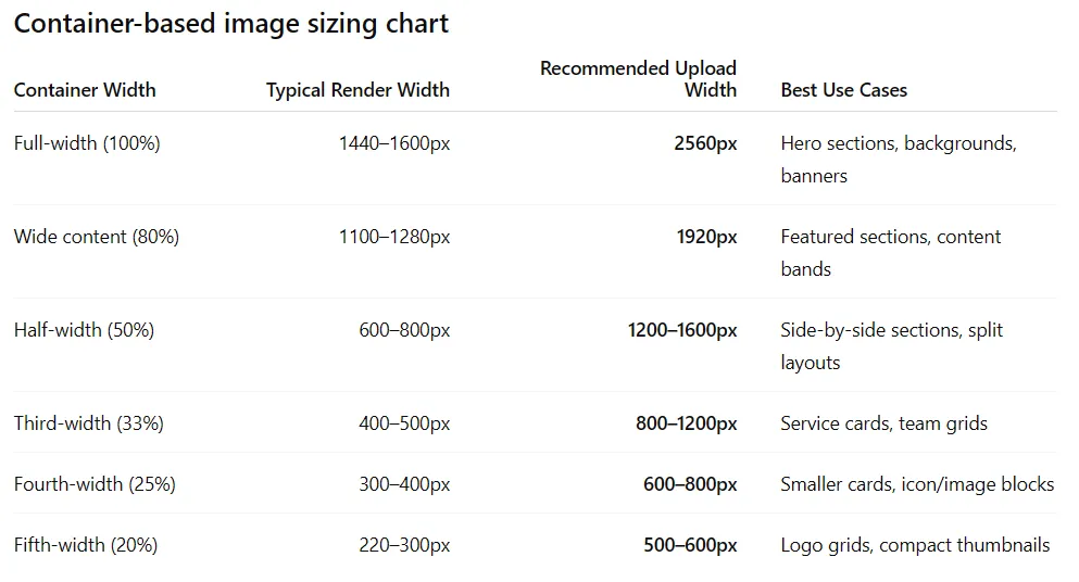
Full-width sections (100%)
Recommended upload width: 2560px
Best for hero sections, banners, and full-width background images.
Wide content sections (around 80%)
Recommended upload width: 1920px
Best for large visual sections inside a contained layout.
Half-width sections (50%)
Recommended upload width: 1200–1600px
Great for side-by-side content and split layouts.
Third-width sections (33%)
Recommended upload width: 800–1200px
Ideal for service blocks, team sections, and content grids.
Quarter-width sections (25%)
Recommended upload width: 600–800px
A good fit for cards, icons with supporting imagery, and smaller content blocks.
Thumbnail or compact images (20% or less)
Recommended upload width: 500–600px
Best for logo grids, small galleries, and supporting visuals.
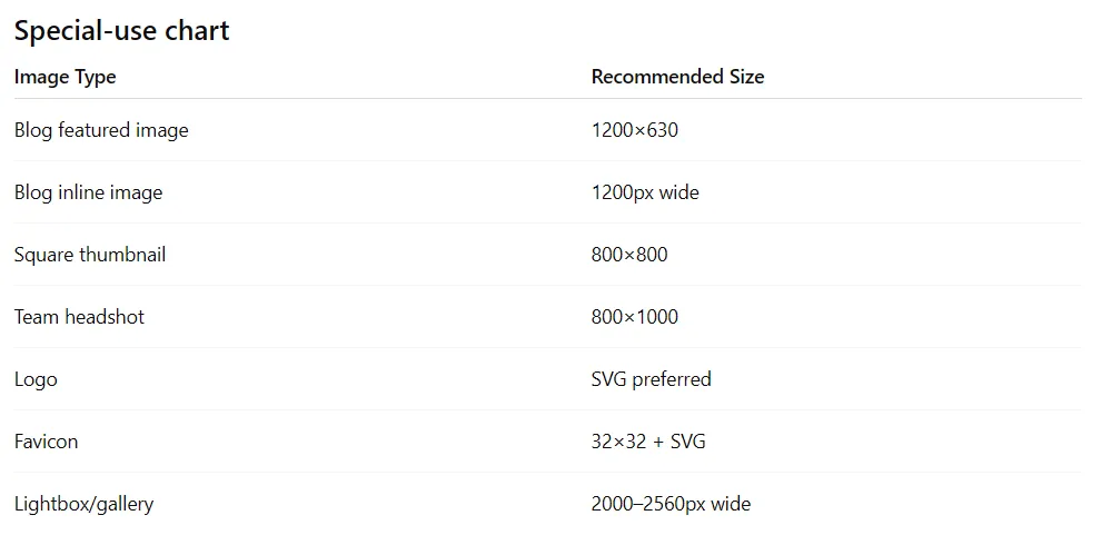
A few special-use image sizes are worth knowing
While most website images should be sized based on the container they live in, there are a few common exceptions where standard dimensions still matter.
These image types often serve a specific purpose beyond simple page layout, so having the right proportions can make a difference.
Your website should be smart enough to do the rest
Uploading the right image size is only part of the process.
A properly built website or CMS should automatically generate multiple responsive versions of that image and serve the right one based on the visitor’s screen size and browser width.
That means if you upload a 2560px hero image, your website should not serve that full-size file to every visitor. It should generate and use smaller versions where appropriate.
This is how modern content management systems like WordPress are designed to work, and it’s one of the reasons responsive image handling matters so much.
The goal is to upload a strong source image and let the system do its job.
Format still matters
The dimensions of your image are important, but the file format matters too.
For most website photos, we recommend WebP because it delivers strong quality with much smaller file sizes than traditional JPGs.
For logos and icons, SVG is usually the best choice because it stays crisp at any size.
Choosing the right format can often improve performance just as much as choosing the right dimensions.
Our simple rule at Lewis Media Group
To keep things practical, here’s the framework we use:
- Full-width images: 2560px wide
- Main content images: 1920px wide
- Half-width images: 1200–1600px wide
- Grid images: 800–1200px wide
- Thumbnails: 500–600px wide
- Logos: SVG
This keeps images looking sharp while helping maintain strong website performance.
The biggest mistake we see is using the same oversized image everywhere, regardless of where it appears on the page. That approach creates heavier pages and slower load times without adding real value.
A smarter image strategy starts with understanding the container, choosing the right source size, and allowing your website to handle responsive delivery from there.
When that system is working well, your site stays fast, clean, and sharp where it counts.